GIFTBEE recipient experience | responsive web app
Simplifying a Complex MVP into a Scalable Platform

From complexity and friction to a clean, scalable MVP with 58% conversion.
From complexity and friction to a clean, scalable MVP with 58% conversion.
About
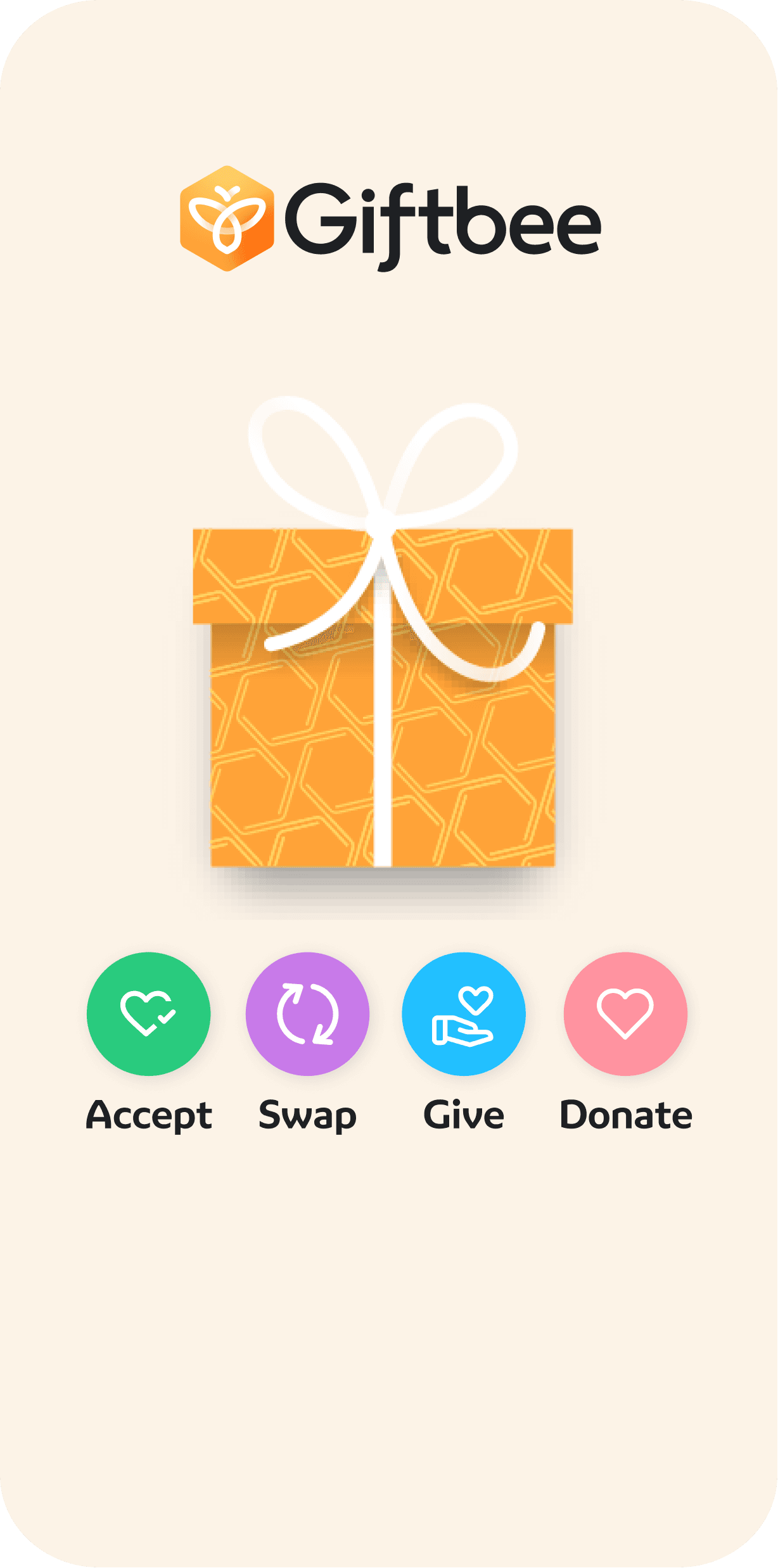
When I joined, Giftbee was evolving from a proof-of-concept into a fully usable product, but its gift journeys (Accept, Swap, Give, Donate) had become deeply entangled, creating backend failures, and delayed launches.
I partnered with a strategic designer to audit and simplify the entire user journey, resolving backend failures and creating a viable path to launch.
Goal
To untangle complex gifting flows (Accept, Swap, Give, Donate) into a clean, intuitive, and developer-friendly experience. The objective was to support Giftbee’s unique flexibility without overwhelming users or systems.
To untangle complex gifting flows (Accept, Swap, Give, Donate) into a clean, intuitive, and developer-friendly experience. The objective was to support Giftbee’s unique flexibility without overwhelming users or systems.
Outcome
Efficiency: Reduced recipient journey steps by 50% across all flows.
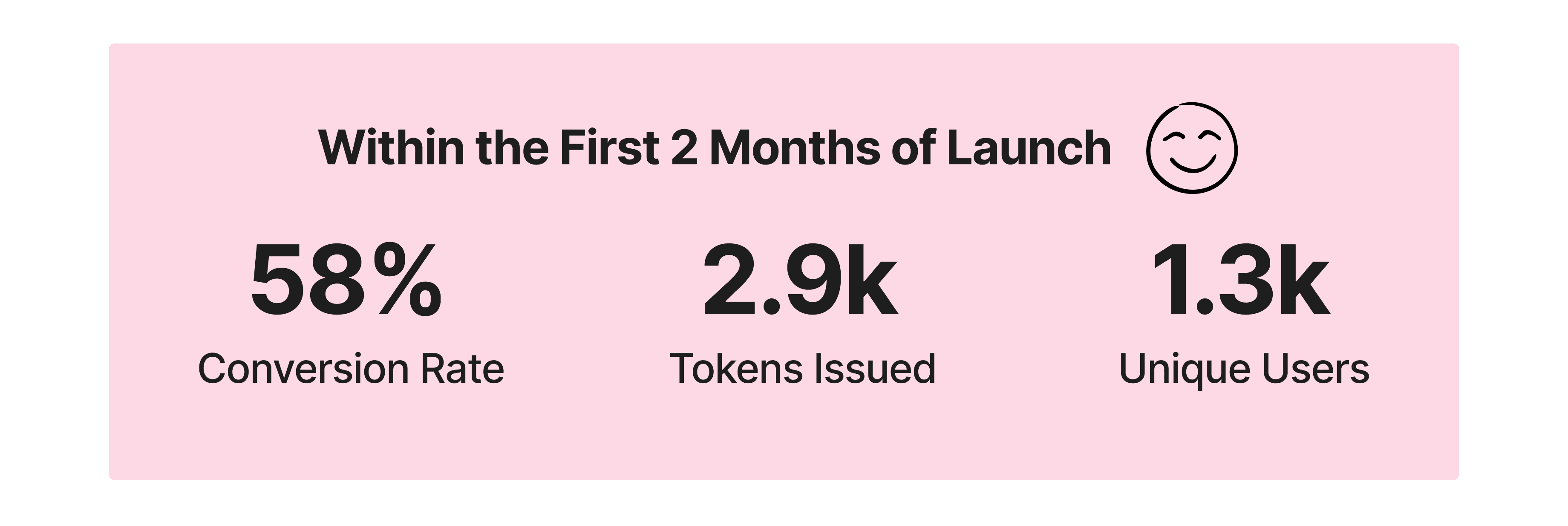
Performance: Launched with a 58% conversion rate and an NPS of 40–50.
Clarity: Eliminated confusing token loops in favor of a single clear decision model.
Volume: Successfully issued 2.9K gift tokens to 1.3K unique users in the first few months.
Efficiency: Reduced recipient journey steps by 50% across all flows.
Performance: Launched with a 58% conversion rate and an NPS of 40–50.
Clarity: Eliminated confusing token loops in favor of a single clear decision model.
Volume: Successfully issued 2.9K gift tokens to 1.3K unique users in the first few months.
process
System Audit → Developer Talks → Solution Space Mapping → Flow Mapping & Deconstruction → UX Simplification → Visual & Terminology Clean-Up → Prototypes → Testing & Iteration
System Audit → Developer Talks → Solution Space Mapping → Flow Mapping & Deconstruction → UX Simplification → Visual & Terminology Clean-Up → Prototypes → Testing & Iteration
Context - Inheriting a growing platform
Context - Inheriting a growing platform
Context - Inheriting a growing platform
I joined the team when Token Gifts was rebranded to Giftbee - a digital gifting platform with flows in place for Accept, Swap, Give Forward, and Donate.
I joined the team when Token Gifts was rebranded to Giftbee - a digital gifting platform with flows in place for Accept, Swap, Give Forward, and Donate.
Early Focus
Early Focus
My first responsibility was rebranding all recipient-facing journeys, translating an existing product into Giftbee’s new identity through updated visuals, colour, and typography.
My first responsibility was rebranding all recipient-facing journeys, translating an existing product into Giftbee’s new identity through updated visuals, colour, and typography.
Growing Complexity
Growing Complexity
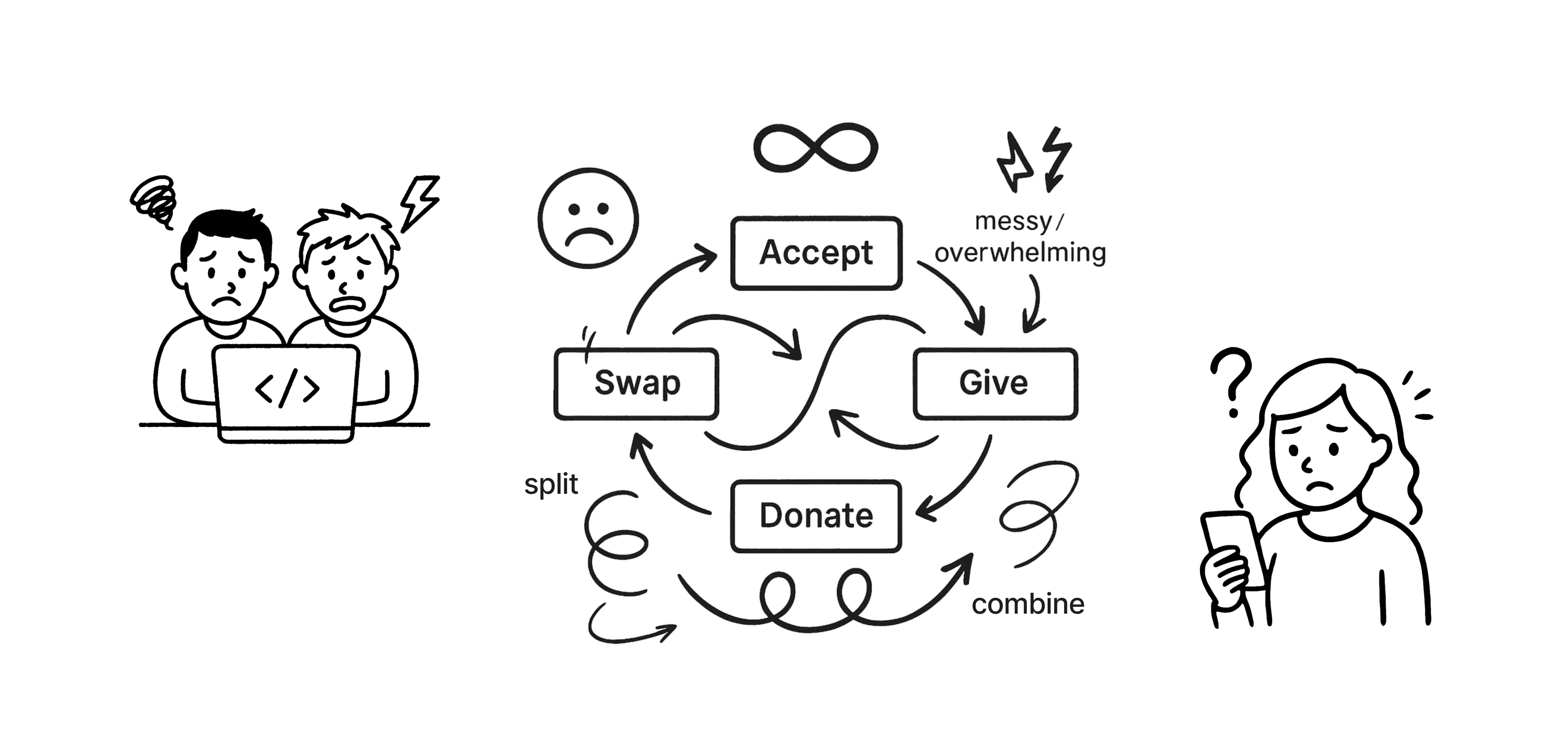
As new features shipped - balance splitting, top-ups, advanced swapping, partial redemption, the experience grew increasingly complex.
Each feature worked in isolation, but together created deeply nested token logic that was hard to understand, fragile to maintain, and risky to scale.
As new features shipped - balance splitting, top-ups, advanced swapping, partial redemption, the experience grew increasingly complex.
Each feature worked in isolation, but together created deeply nested token logic that was hard to understand, fragile to maintain, and risky to scale.
Breaking Point
Breaking Point
The platform became tightly coupled to “gift tokens” that could be endlessly split and recombined, leading to confusing user journeys and backend failures. What began as execution work revealed the need for a structural reset.
The platform became tightly coupled to “gift tokens” that could be endlessly split and recombined, leading to confusing user journeys and backend failures. What began as execution work revealed the need for a structural reset.
Reset & Reframe
Reset & Reframe
Following stalled launches, Giftbee brought in a new in-house dev team, Head of Technology, and strategic designer/researcher.
I partnered closely with Jayne to audit the system end-to-end and reimagine a simpler, scalable foundation for the product.
Following stalled launches, Giftbee brought in a new in-house dev team, Head of Technology, and strategic designer/researcher.
I partnered closely with Jayne to audit the system end-to-end and reimagine a simpler, scalable foundation for the product.
Process: Untangling the Experience, Step by Step
Process: Untangling the Experience, Step by Step
Process: Untangling the Experience, Step by Step
Starting with the Whole Picture
Starting with the Whole Picture
Starting with the Whole Picture
Because I was already familiar with how Giftbee’s flows worked, I began by speaking with the engineering team. I asked them to break down what was failing, what was hard to build, and where they felt complexity was highest. Their input helped surface technical constraints that weren’t visible at the surface level.
From there, I created a Solution Space Perspective Grid, mapping out:
User needs
The barriers and friction points
The value potential of solving each one
And the product capabilities needed to unlock that value
User needs
The barriers and friction points
The value potential of solving each one
And the product capabilities needed to unlock that value
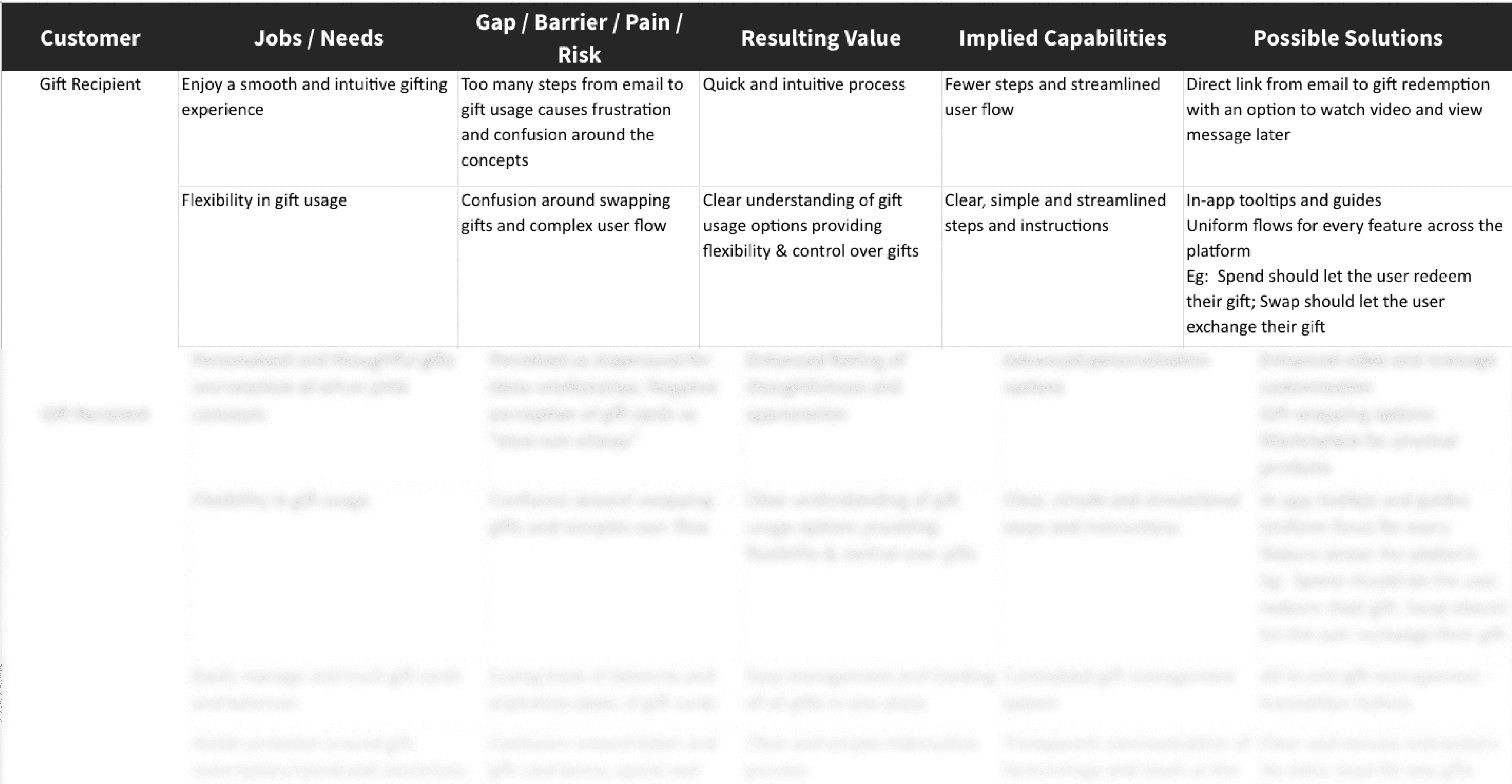
This framework became the strategic lens through which we evaluated every flow.
Auditing Every Flow
Auditing Every Flow
Auditing Every Flow
Together with Jayne (strategic designer and user researcher), we revisited insights from earlier usability testing, observing how users unwrapped, explored, and redeemed gifts. Combined with engineering input and our strategic framework, this gave us a clear, end-to-end view of what needed fixing.
We then broke down every flow on the platform.
①
①
Receiving a gift
Receiving a gift
②
②
Exploring the vault
Exploring the vault
③
③
Using features like Accept, Swap, Give Forward, Donate
Using features like Accept, Swap, Give Forward, Donate
④
④
Managing balances and topping up
Managing balances and topping up
⑤
⑤
Edge cases like combining gifts or splitting values
Edge cases like combining gifts or splitting values
The Hard Questions - For each one, we mapped every step and then cut the fluff. If a flow had 8-10 steps, we brought it down to 4-5. We asked ourselves the hard questions like:


The answer was often, too much flexibility was causing too much fragility!
Designing for Core Decisions
Designing for Core Decisions
Designing for Core Decisions
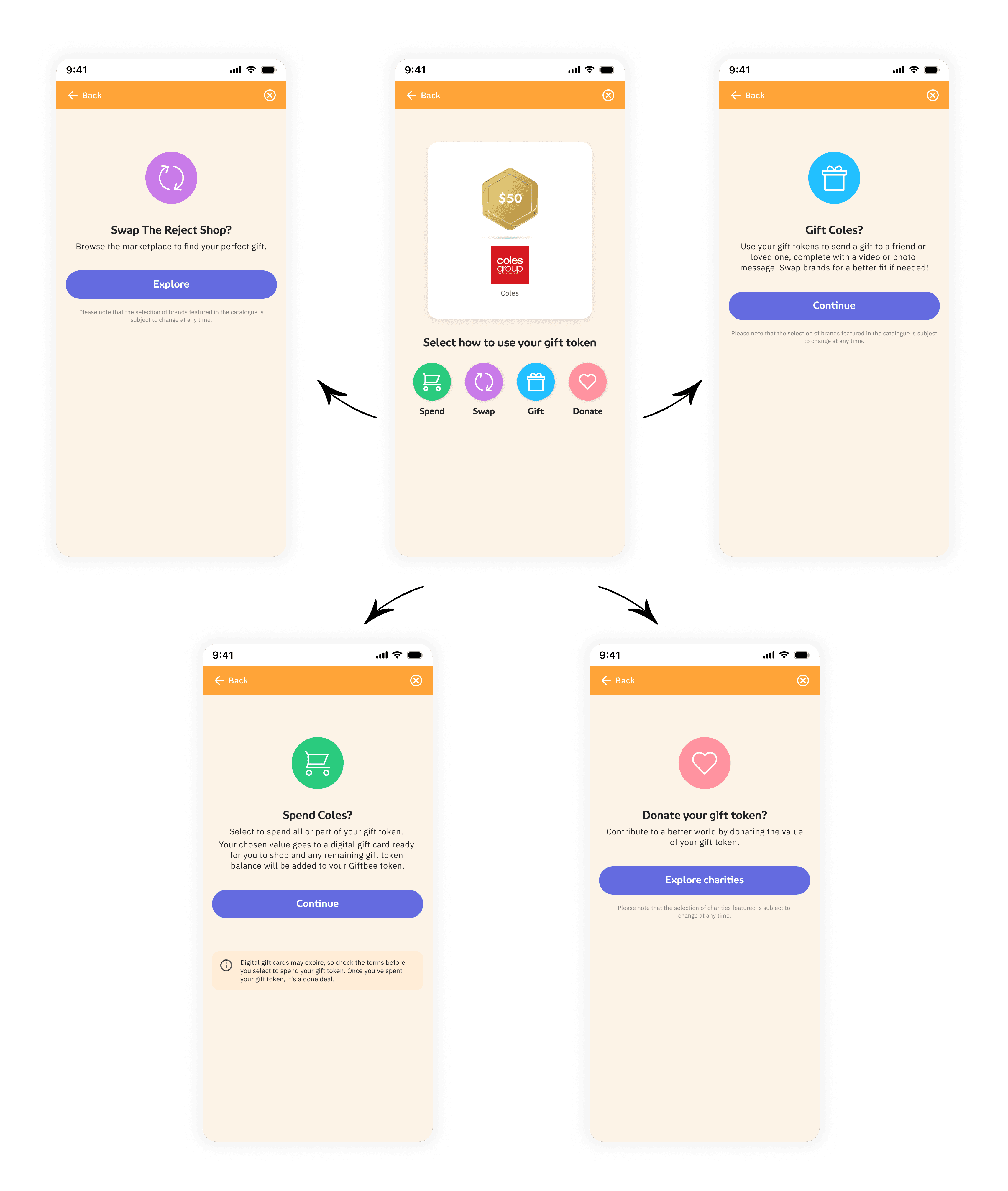
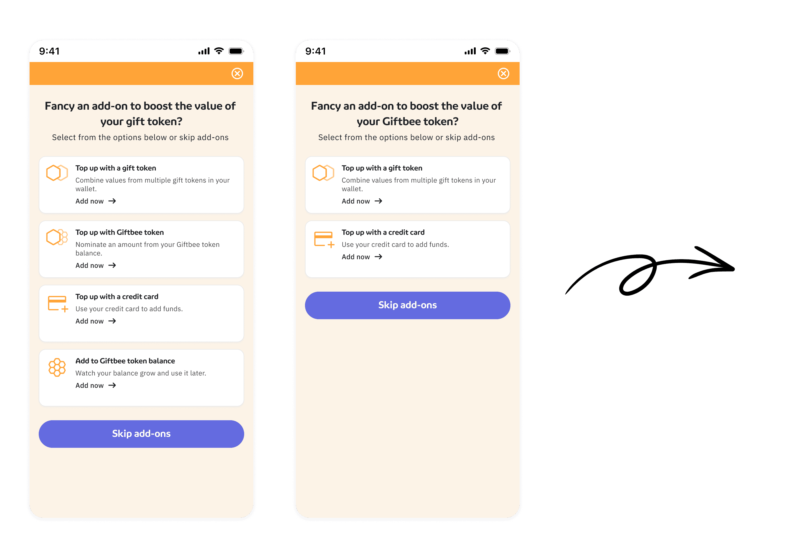
Instead of offering endless token-to-token interactions and infinite loops, we simplified the experience into one core decision. We also eliminated “token” as a concept from user-facing language, using simpler terms like “gift” or “balance” wherever possible
Instead of offering endless token-to-token interactions and infinite loops, we simplified the experience into one core decision. We also eliminated “token” as a concept from user-facing language, using simpler terms like “gift” or “balance” wherever possible
"You’ve received a gift - what do you want to do with it?"
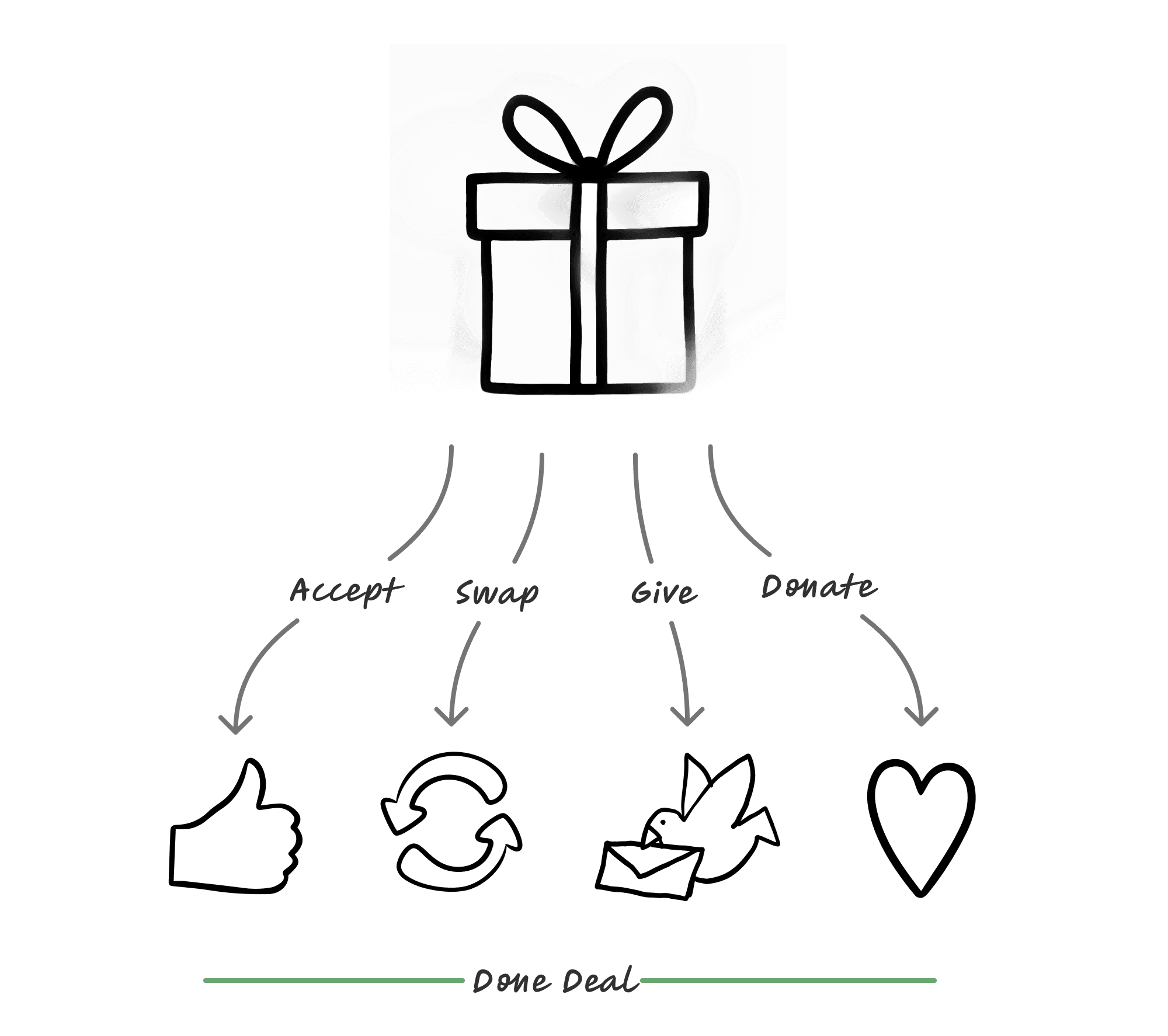
No more recursive token logic. No unnecessary choices. Just one clear action at a time.
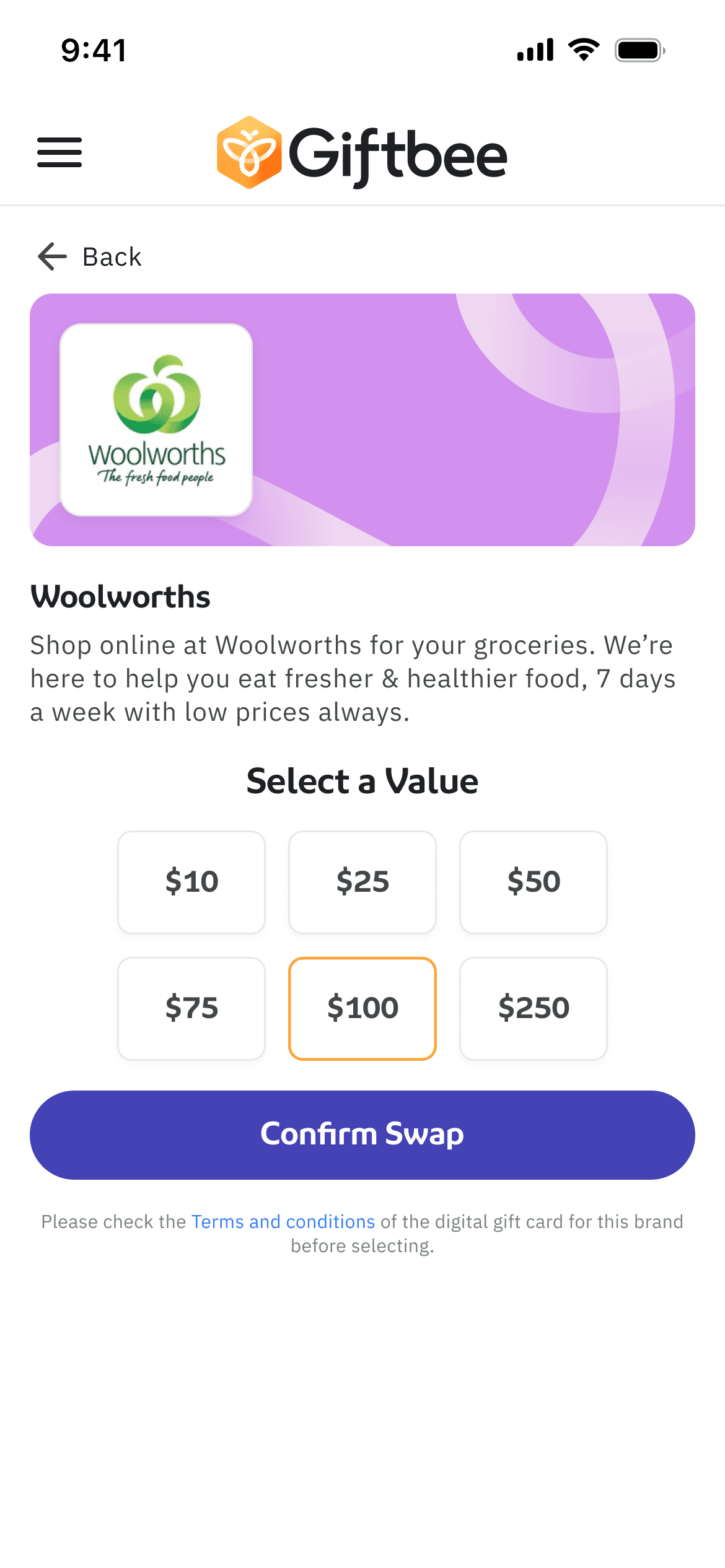
Handling Split & Combine with Simplicity
Handling Split & Combine with Simplicity
Handling Split & Combine with Simplicity
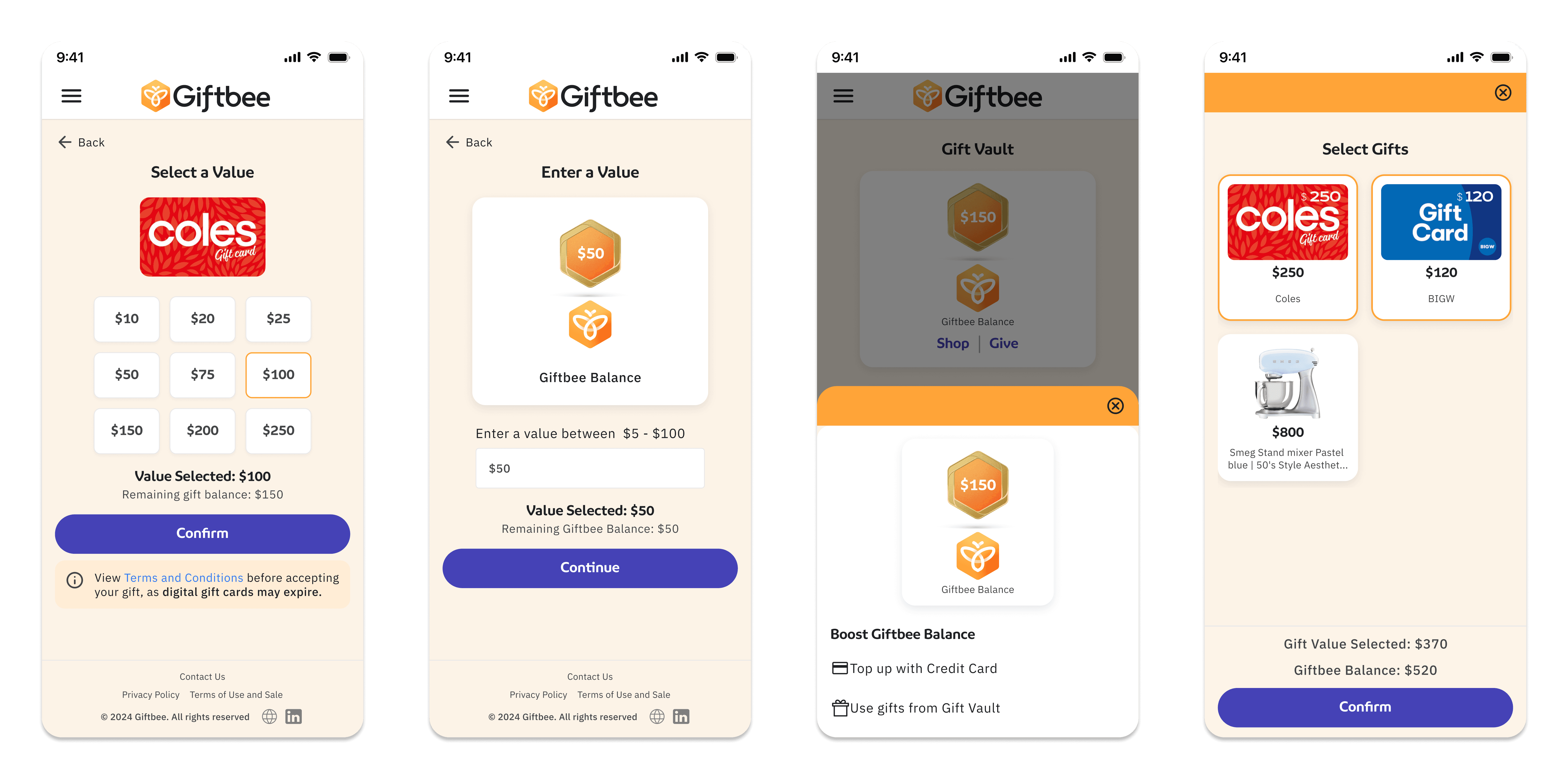
We didn't eliminate flexibility. We just folded it back into the core flows, where it made sense:
Partial redemptions (e.g., redeem $20 out of a $50 gift) were handled cleanly within the Accept flow
Combining multiple gift values was reframed: users could pull value into their Giftbee Balance, then shop freely. No need to awkwardly fuse brand-specific cards


Delivery Snapshot
Delivery Snapshot
Delivery Snapshot
The development team was rebuilding from scratch, so we phased the redesign strategically:
Core flows: unwrap, account creation, accept, swap, give forward
Giftbee Balance functionality
Top-ups, split redemptions, and balance usage
This phased delivery made engineering easier, reduced risk, and allowed us to test improvements iteratively.
Design Execution: Clutter to Clarity
Design Execution: Clutter to Clarity
Design Execution: Clutter to Clarity
Once we had redefined the experience, I led the redesign of the core recipient interface, making it both visually simpler and functionally sharper. Here's how:
Once we had redefined the experience, I led the redesign of the core recipient interface, making it both visually simpler and functionally sharper. Here's how:
①
①
Gift Vault Reimagined
Gift Vault Reimagined
The old GiftVault had two confusing tabs: Gift Tokens and Gift Cards. User interviews showed that they didn't understand the distinction.
The old GiftVault had two confusing tabs: Gift Tokens and Gift Cards. User interviews showed that they didn't understand the distinction.
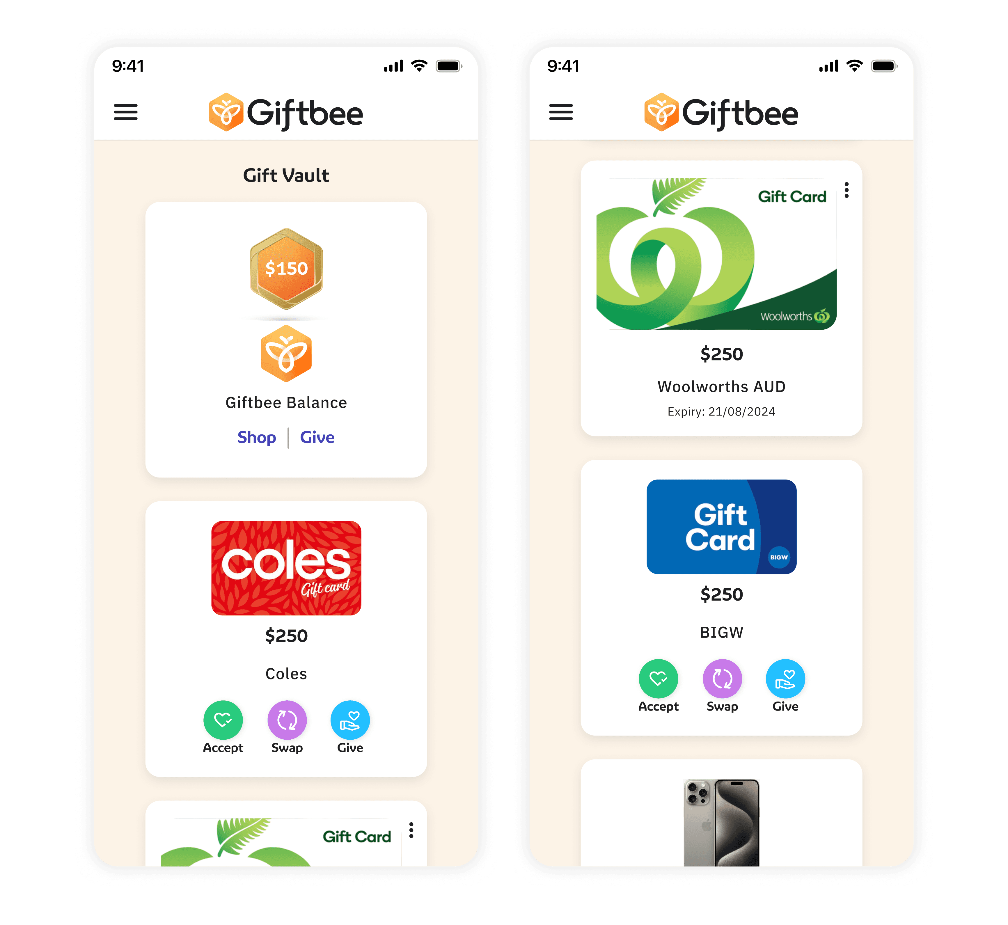
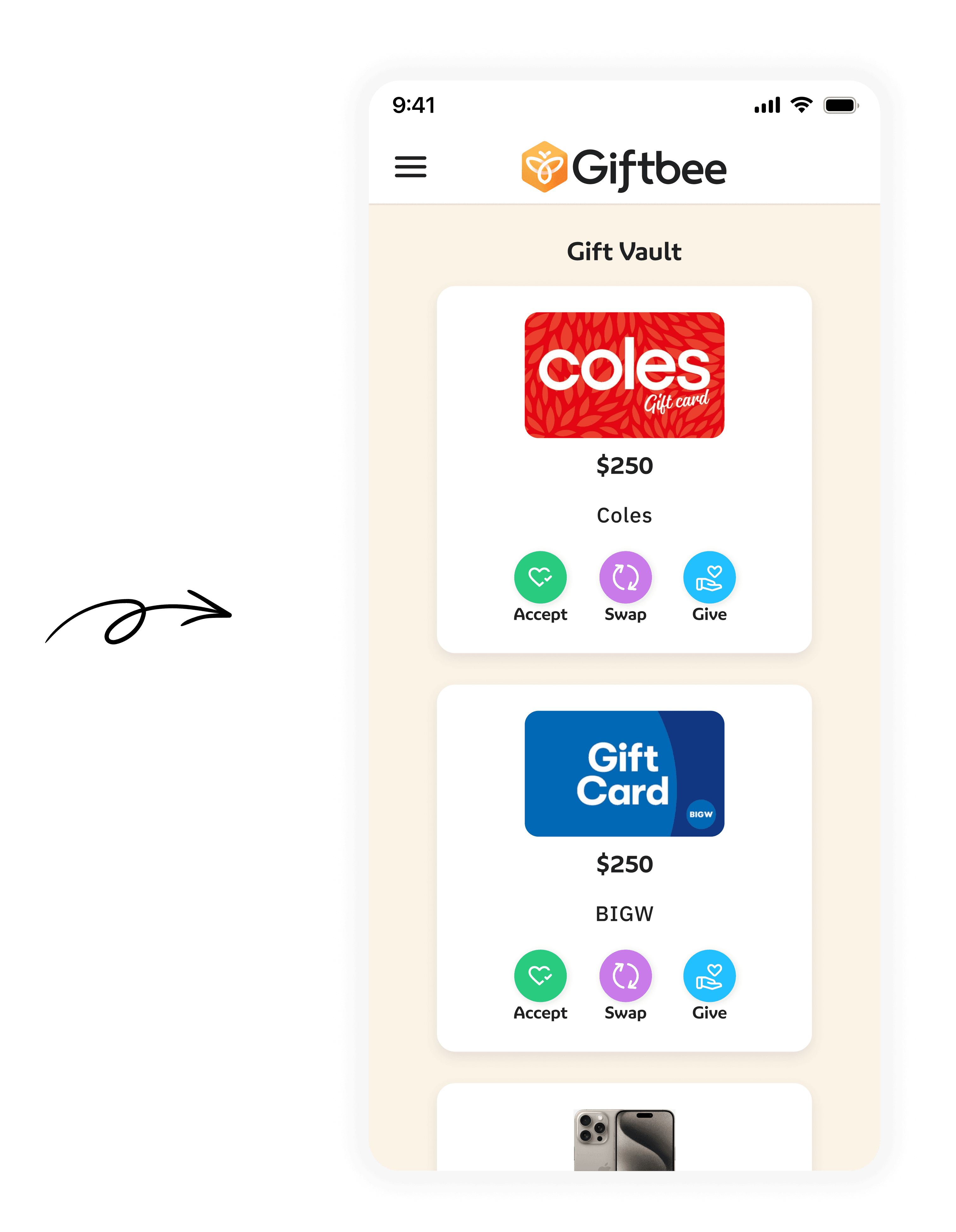
Unified everything into a single Gift Vault view.
Listed accepted and unaccepted gifts together (stacked on mobile, grid on desktop).
Clearly marked unaccepted gifts with visible action buttons.
Accepted gifts are displayed in a clean layout reducing navigation effort and mental load.
Unified everything into a single Gift Vault view.
Listed accepted and unaccepted gifts together (stacked on mobile, grid on desktop).
Clearly marked unaccepted gifts with visible action buttons.
Accepted gifts are displayed in a clean layout reducing navigation effort and mental load.
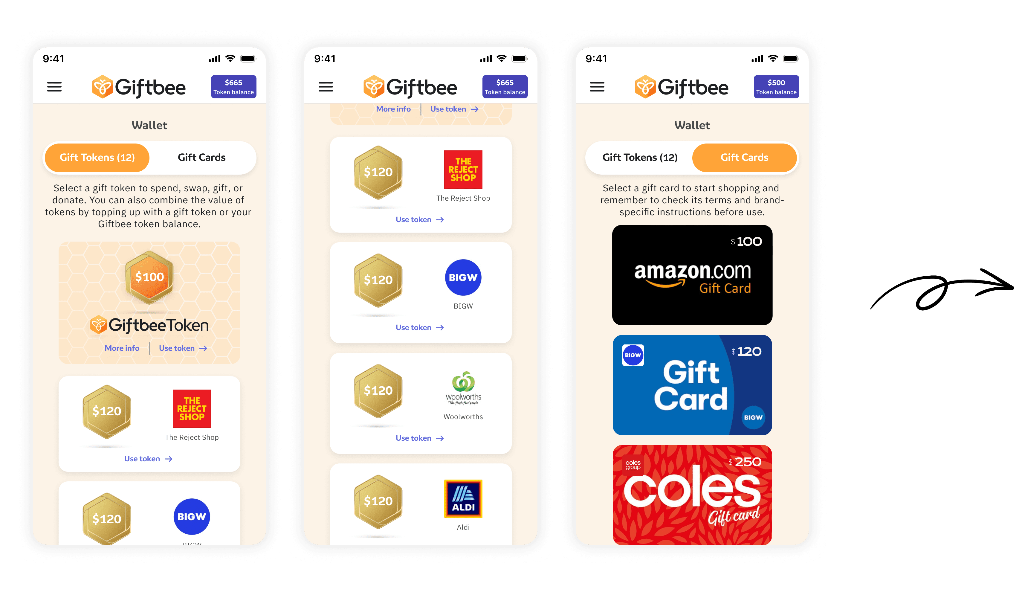
②
②
Streamlined Gift Actions
Streamlined Gift Actions
Previously, users had to click into a gift just to see options like redeem, exchange, regift, or donate. We eliminated that extra step.
Previously, users had to click into a gift just to see options like redeem, exchange, regift, or donate. We eliminated that extra step.
Action buttons Accept, Swap, Give are displayed directly under each unaccepted gift.
Donate was put on hold to sort out the logistics and permissions with the charitable organisations
Action buttons Accept, Swap, Give are displayed directly under each unaccepted gift.
Donate was put on hold to sort out the logistics and permissions with the charitable organisations
③
③
Terminology Cleanup
Terminology Cleanup
Changed “Redeem” to “Accept” (more human, emotionally resonant)
Changed “Exchange” to “Swap”
Rebranded “Regift” to “Give” (less shame, more warmth)
Standardized everything under a single term: Giftbee Balance (previously Wallet Balance vs Giftbee Balance)
Removed all “token” language from the user-facing UI (kept it only internally for logic)
④
④
Split & Combine, Simplified
Split & Combine, Simplified
Split functionality was previously a separate flow. I built it into the core actions:
Split functionality was previously a separate flow. I built it into the core actions:
Users could now choose how much of a gift to accept, swap, donate, or give forward, seamlessly within the same action.
For combining gifts, we removed merging items brand by brand. Instead, users could pull value into their Giftbee Balance.
Users could now choose how much of a gift to accept, swap, donate, or give forward, seamlessly within the same action.
For combining gifts, we removed merging items brand by brand. Instead, users could pull value into their Giftbee Balance.
⑤
⑤
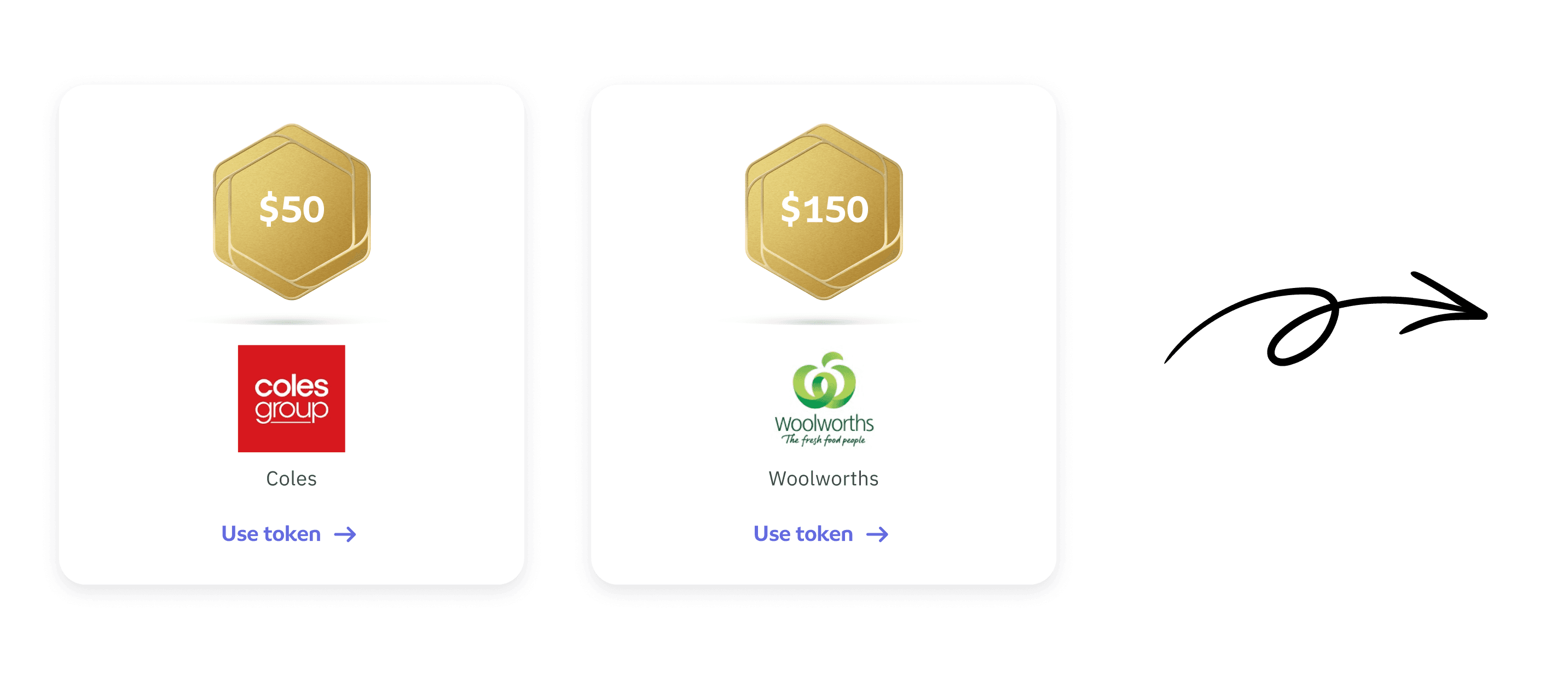
Visual Redesign
Visual Redesign
The old gift cards had a small brand image inside a large, clunky hexagonal token. We removed the token metaphor entirely, redesigned the cards to:
The old gift cards had a small brand image inside a large, clunky hexagonal token. We removed the token metaphor entirely, redesigned the cards to:
Highlight the gift image and name
Show action buttons for unaccepted gifts
Keep accepted gifts clean and minimal
Highlight the gift image and name
Show action buttons for unaccepted gifts
Keep accepted gifts clean and minimal
Prototypes, Feedback Loops & Delivery
Prototypes, Feedback Loops & Delivery
Prototypes, Feedback Loops & Delivery
I built clickable prototypes for all new flows and tested them with users alongside Jayne.
We combined task-based usability testing with qual feedback, iterated on language and UI affordances, and improved based on real usage.
We also created a polished prototype demo for our CEO to use in client pitches, showing the recipient journeys. This helped us land early business partnerships.
We delivered in phases aligned with the rebuild. I structured the designs with:
Per-screen annotations
Flow documentation
Clear explanation of logic, edge cases, and states
About
Post-launch research to decode user behavior within the Giftbee ecosystem.
I led a multi-method UX research initiative to study real gifting and redemption behaviours, uncovering patterns that directly shaped Giftbee’s next product phase.
Goal
Evaluate Conversion: Comparing Guest Checkout vs. Account Creation to measure the impact on trust and speed.
Identify Friction: Uncovering behavioral patterns related to decision-making and confusion points.
Outcome
Friction Reduction: Identified and neutralized critical drop-off points in the redemption journey.
Behavioral Clarity: Uncovered core trust drivers & terminology confusions that informed a high-conversion unwrap page redesign.
Strategic Handoff: Provided a validated roadmap of UI refinements and A/B test priorities for the next product cycle.
process
Research Planning → Moderated Qual Interviews → A/B Testing → Behavioural Analysis → Quant Survey → Insight Synthesis → Roadmap alignment → External storytelling
From complexity and friction to a clean, scalable MVP with 58% conversion.
Scale & Impact of this project
Scale & Impact of this project
Scale & Impact of this project
“Neha, these simplified journeys are brilliant. You’ve done amazing work here. Thank you on behalf of all of us. This made our lives so much easier.”
Head of Engineering
Head of Engineering
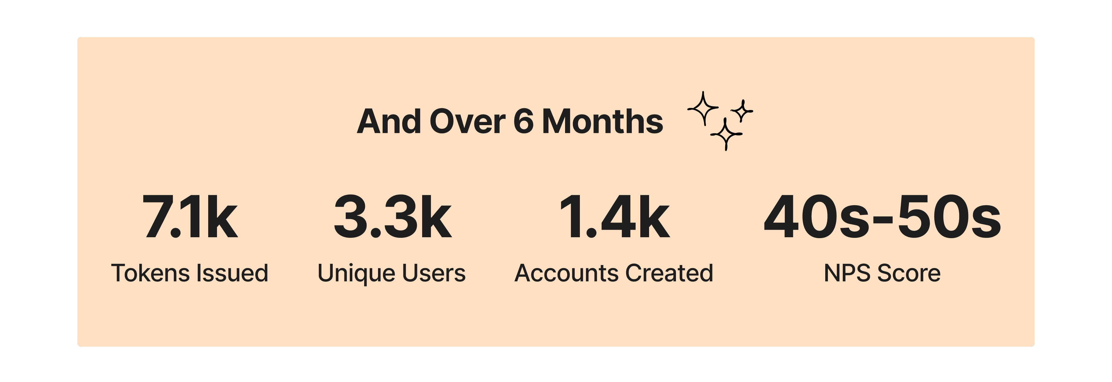
And the metrics back it up:
Reflections
Reflections
Reflections
To leap forward, sometimes you have to first take a big step back.
It would have been easier to keep patching, fixing, and stacking features. But instead, I paused, asked the hard questions, and helped the team redesign from the ground up.
I’m proud that I led this change while still early in my career. I worked directly with leadership, rallied support, and found joy in removing complexity and creating clarity.
I learned how powerful it can be to:


Most of all, I learned that minimalism is an act of care and that simplification is not just aesthetic, it’s strategic.
Most of all, I learned that minimalism is an act of care and that simplification is not just aesthetic, it’s strategic.